Testing New Billiards Logo
10/26/2009 7:54:37 PM
Testing New Billiards Logo
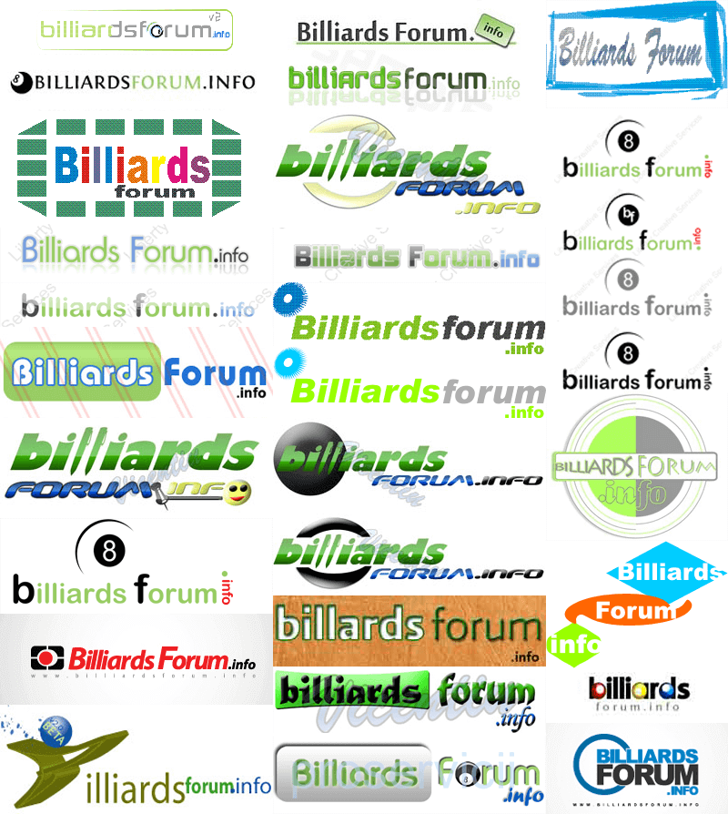
Around a month ago, we hired 5 freelancers to design us a new billiard logo. Well actually, we asked that our current logo be "polished" up a little. The responses ranged from horrendous to halfway decent.
We learned that there are a lot of HORRIBLE billiard logo designers out there. Now - you will look at these and say that some aren't that bad. You would be correct. But part of being a "good" billiard logo designer is about understanding the sport, and the company you are designing for. We asked that they retain elements from the current logo, since it's been our logo for so long now, it has some brand value so we wanted to retain it. It had to incorporate site colors - mainly green, and dark grey, and potentially some of the blue. Finally, it had to AVOID corny use of "8 ball clip art" and other cliched billiard clip art. AS you can see, most didn't understand that requirement.
As you will see, it looks like just about anyone with a hacked copy of adobe illustrator can go out and be an expert designer. Not the case. We did our current logo in-house - mostly work done by me. It's simple and clean, which was another requirement that these designers didn't adhere to.
I'll start with the worst:

The Finalists
If you suffered through those 30 horrible attempts of other designer to redesign our billiards website logo, you should be pleasantly surprised at the half-decent offerings from the 5 designers we actually paid money to.
We have not yet decided on one (or any) of these yet, but we now "own" the rights to all of them, having paid these designers in full. It may come to us combining some of the best features from each, or s****ping them all. We're not sure yet, but at least we got the preliminary stuff out of the way.
To show you what we've come from - here is how our billiard logo looked in the past.
Let us know what you think of the new versions. What we should keep, what we should drop. Comments welcomed.
The billiards forum logo before June 2006:

The billiards forum logo after June 2006

The billiards forum logo after September 2008

The New Billiards Forum Logo Design preliminaries
The first three are "polished" versions of our current logo, with a few adjustments, enhancements, and a bit of shine and professional touch.


The next one is a similar version to those above, but the green background is on the "forum" instead of the billiards. We're not sure about that yet, but wanted to show it anyway.

This final billiards logo is completely different, but we wanted to keep at least one different logo in mind. This one was the best implementation of actually billiard items into the logo.

Testing New Billiards Logo
Replies & Comments
Fenwick on 10/27/2009 3:01:04 AM
My 2 cents, the last one. Easier on the eyes and pool related.Text
 quickshot on 10/27/2009 6:30:04 AM
I personally like the one that is presently being used. It is informative, easy to read and understand, and user friendly. As for the last one, it is, IMHO, too glaring and attacks the eyes. It is something I would expect to see on some back alley poolrom.
My suggestion: "if it is not broken don't fix it."
Mitch Alsup on 10/27/2009 1:00:04 PM
If you HAVE TO change it; I like the one with the V2.0 sticker.
But I am completely content with the current logo.
Fenwick on 10/28/2009 9:58:30 PM
20 views and only 3 votes?
 quickshot on 11/2/2009 3:56:58 PM
Gotta make you wonder?
Fenwick on 11/2/2009 8:48:29 PM
I had to look up V2.0 sticker. I still don't know what it is for sure. Poor voter turn out IMHO.
Testing New Billiards Logo
- Title: Testing New Billiards Logo
- Author: billiardsforum (Billiards Forum)
- Published: 10/26/2009 7:54:37 PM
